A Complicated Logo (part 1)
Complicated Nonsense has not had a logo for the first 3 years of its existence. It worked fine for me so far, but now that I started working on showcasing my work old and new, I would like to make it more coherent by branding it appropriately.
I want to create a brand identity for Complicated Nonsense, but I am not much for graphic design. I do need a logo that I can use in print and various static material, but otherwise it can be interactive and in motion, because most of the time it will be seen on screens and on the website.
So I decided to create an interactive logo. This article is the documentation of my first attempts to do so.
The pillars
My idea was to make something web-native that can look crisp and beautiful on all devices.
Since in 2023 most browsers support html canvas, I decided it's the best tool to develop this logo with. There are other tools like Processing or p5.js but I decided not to use them for this, to avoid another dependency. I want my logo to be both compact and lightweight, as well as representative of the ideas of complexity and nonsense.
Spoiler alert: this idea evolved a bit when I learned the most important rule of modern web dev, which is to design for mobile first, and mobile doesn't have the hover interaction (because there is no mouse cursor, there is only tapping and scrolling). So my first attempts, that will be showcased here, suffer from this lack of understanding.
Logo versions
A little bit of history
For the first three years of existence, the Complicated Nonsense website only had a unity prototype in WebGL with a simple swarm simulation of each letter of the name Complicated Nonsense floating on the screen, the user having the ability to move them around for fun. Turns out Complicated Nonsense is an anagram of many funny things and it's pretty fun to see what one can make with it.
This demo was hosted on a backend running PHP, which is not compatible with the new backend running nuxt, therefore it is not accessible anymore.
Note: a video of the old demo might be included here at some point.

Modular Synth Logo
Note: an interactive version will be included here at some point.
My first attempt was to play around with random colors and lines, because complicated nonsense is all about making lots of connections between unrelated things in some messy way and finding beauty in it.
Here's a video showing the results:
I did this in raw javascript and I reached a point where I was progressing too slowly. I wanted to add sliders more easily, and have different features, and most of the web is built with techniques that are not available when you use raw javascript. So I decided to do it in vue.js and finally learn how to do it like the webdev kids do it nowadays.
The screen recording was made for me to have something to share quickly with a couple of friends. I put it on youtube and a funny thing happened: I got a lot of views because it was recommended to people in the algorithm. Too bad I rarely post this type of stuff, but it was nice to see people arguing about "what is art?" in the comments.
Processing Dev Days Copenhagen 2023
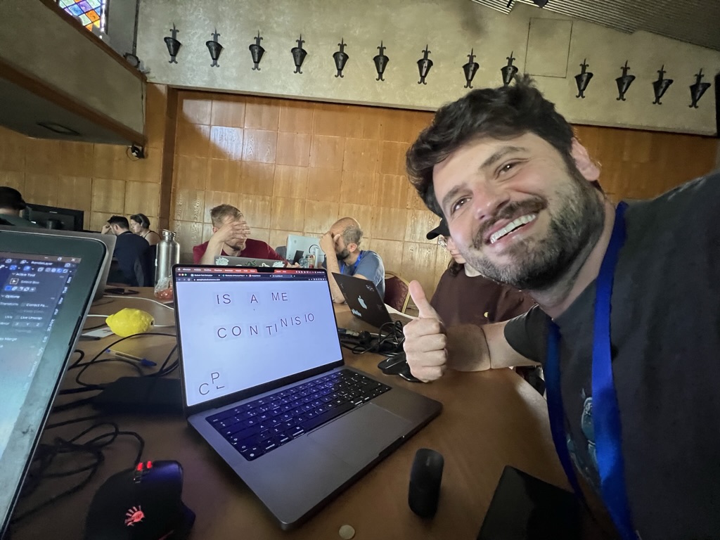
It so happened that I visited an event called Processing Dev Days in Copenhagen the day after I made the modular logo, where artists and designers were sharing their creative coding adventures. They were developing similar artsy graphics made with the use of code. Some of them built a career out of code-based graphics, and I could see similarities with what I was doing, quite by surprise.
It was nice to hear the speakers, see what everybody was working on, and talk about my project as well.
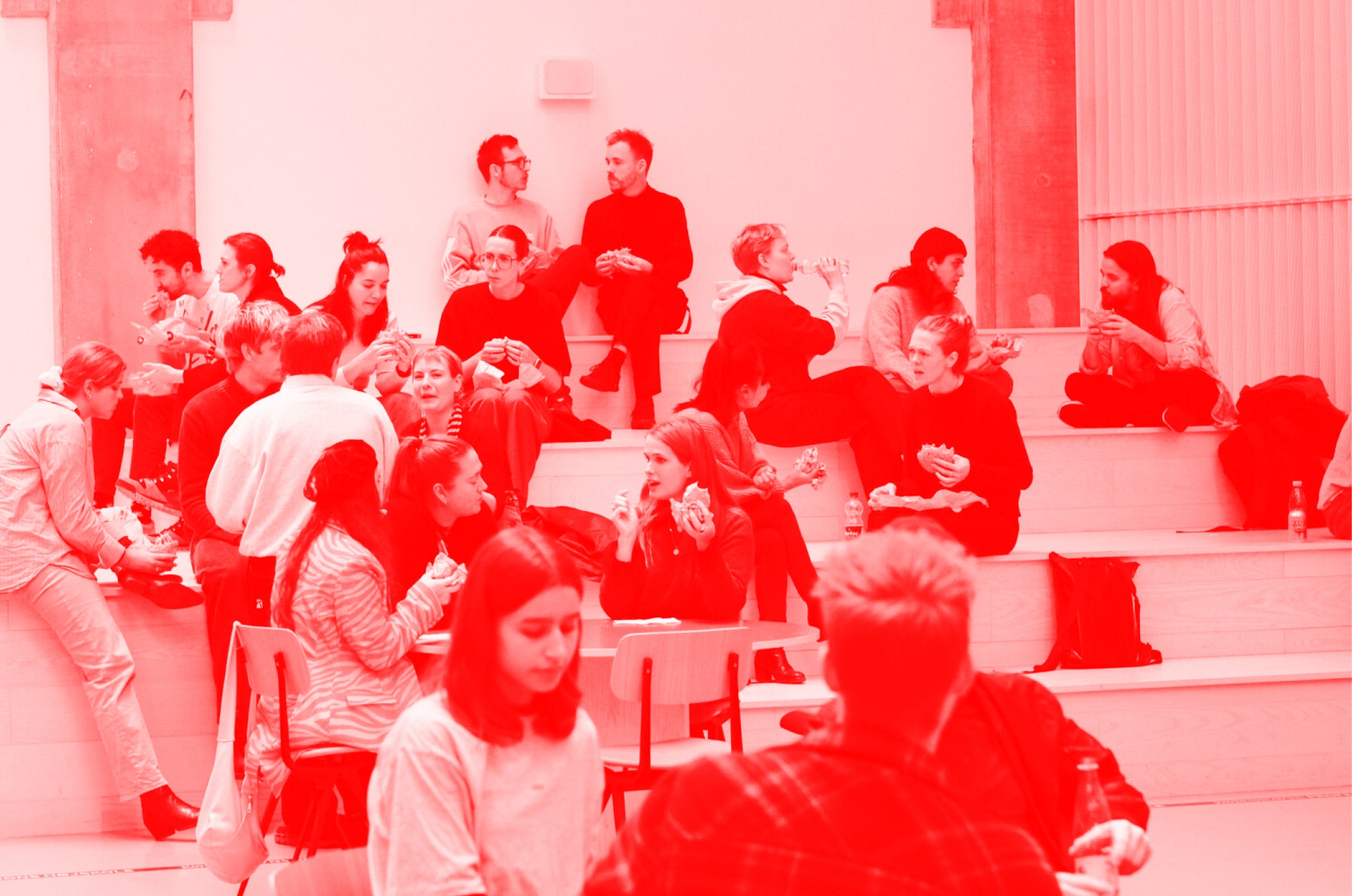
A link with more about this event by one of the speakers, Tim Rodenbröker. Picture below by Rune Madsen, another speaker and participant at the event.

Back to the logo: I decided it's not what I needed. It looked too much like the map of the subway, or like modular synth cables. And tho I am a big fan and user of modular synths, it doesn't represent complicated nonsense, so I kept exploring.
Pirated Modern Art Logo
Note: an interactive version will be included here at some point.
Here is an upgraded version of the previous experiment, with more sliders, where I played with other aspects like shakiness, a fake rotation which is just an oscillation of the end points of each line, and of course the colors. By the way, the phrase "Pirated Modern Art" comes from a comment from the first logo showcase video.
This version is made in simple javascript but using vue.js and lives in a component that I can swap with other demos, allowing me to explore more random demos and techniques more easily, and reuse components like those sliders.
Once I made this version it started to be a bit clunky to not have a backend system that can take care of loading data and stuff, and that's when I discovered nuxt.js, a library that builds upon vue.js and offers a lot of nice features, which I realized I will need for the Complicated Nonsense website later on. So I started again in nuxt, this time preparing to support the full site that will host all the articles in Complicated Nonsense and more.
Blob logo
Later on the new nuxt site, I didn't want to deal with moving the interactive prototype from the old vue project (it might have been extremely easy to do but I just didn't want to spend the energy figuring it out), so I came up with a quick blob logo: some moving circles that change according to a sampled noise function from the package fast-simplex-noise. With some extra tweaks I made it colorful and I gave it an interactive component on mouse over, to signify openness. When open, the circles stop using the noise except for the color, and move in a more clean circular path which feels a lot like a loading icon of sorts.
It's a handy interactive graphic that looks pretty interesting as a menu icon, however it still doesn't inspire me to think of the type of work I do and want to do at complicated nonsense.
I like how it looks when there are many of them in a row so I made a quick toy that allows you to create more or fewer logos in a grid. Press up and down arrow to change the amount of logos. Warning: it gets pretty sluggish on various browsers, so refresh the page or press the down arrow to reduce the amount.
It's not it, but I started using this logo for now because I am swamped with other tasks.
Another note: mobile users cannot hover with the mouse cursor as they don't have a mouse, thus the toy is not as fun for them.
Final notes
These first prototypes were fun to develop and helpful to learn from.
I learned that an interactive logo is possible to have a "look", and be recognizable as the same logo even though it is actually unique in every frame. This is not a new idea, as made clear by many designers from the Processing developer community.
I learned that simple logic can give birth to enough complexity that it is possible to design such a logo for my brand, but it requires more skills in branding to apply it to every platform and every situation necessary. For instance mobile users, which were the most common when it comes to showing random people my work when I'm on the go, were not able to interact with the logo I designed for desktop.
I learned some tricks about using colors and shapes to convey certain moods, and how I can make colors and shapes more consistent by using math rather than eyeballing the values in an arbitrary fashion.
I re-learned the value of fast workflows, and how I lack them in webdev, as I am used to Unity where there are alot of menus and opportunities to do quick editors for your designs.
I learned some web technologies, namely html canvas, vue.js and nuxt, to be able to improve my workflow, speed and output, but I spent so much time on improving my workflow that I did not have time to develop the content, so I only got this article and a half-baked logo (which I will replace ... at some point).
Thanks for reading and I hope this gives you some inspiration.